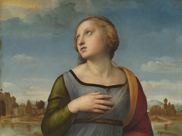
What is the colour of ideas? An absurd and unanswerable question, of course. But pertinent amid several museum openings and anniversaries this year. I was prompted to think about this subject by my conversation with the architect Annabelle Selldorf on The Week in Art podcast in March. She was telling me about the new auditorium in her $220m revamp of New York’s Frick Collection. She described her thoughts on its colour. With no daylight, it could be “like an overcast sky, and you can be completely enveloped by the nothingness of it”. The space, she said, has a “lightness” and “calm” ideal for hearing lectures or talks or musical performances. “It’s a quite unique and meditative experience.”
The colour of the Frick’s new auditorium was selected to create a calm environment © Nicholas Venezia
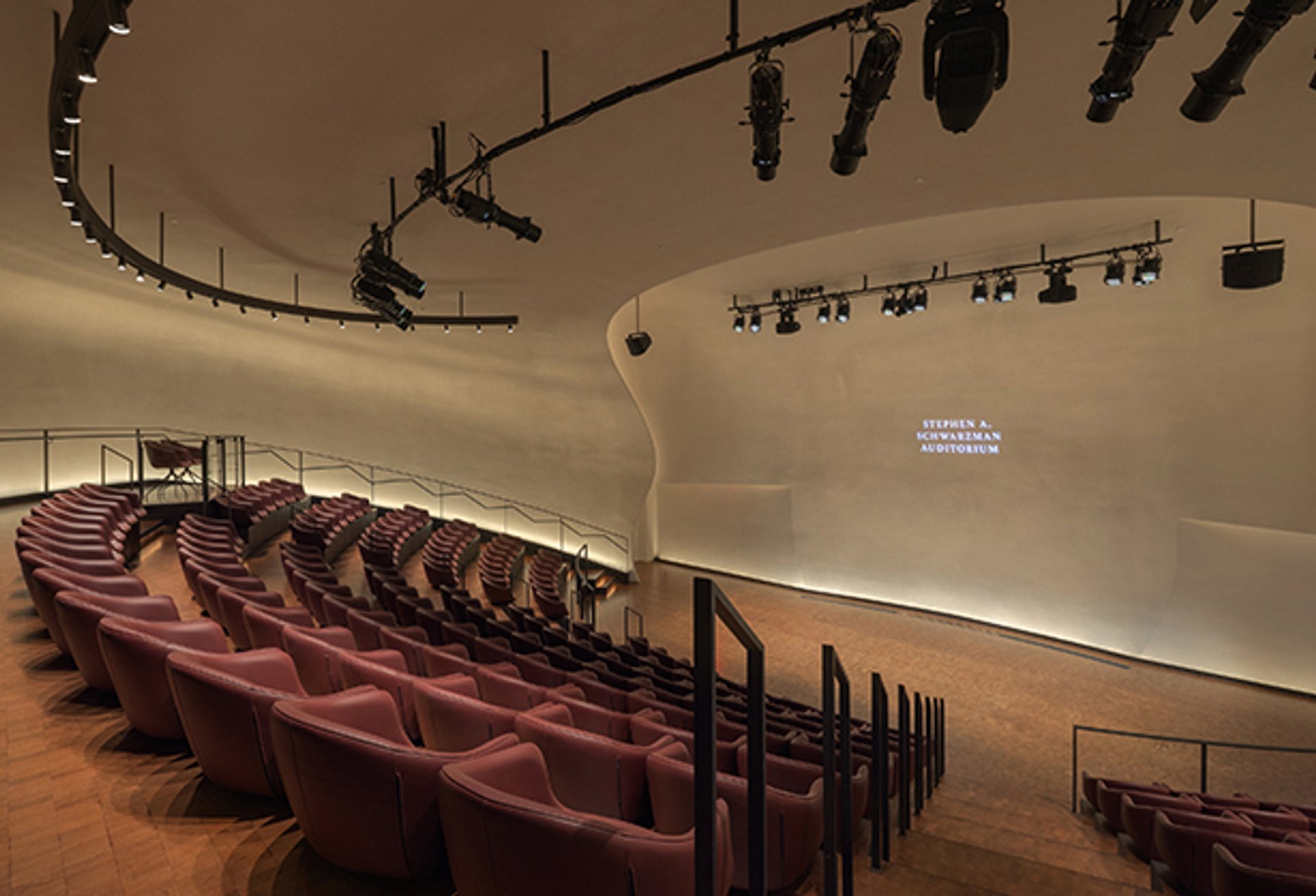
That muted grey could not be a more different hue than the one that once decorated Tate Modern’s Starr Cinema. When the museum opened in 2000, it was a shocking red. The architect Jacques Herzog explained that, because the auditorium would be the museum’s centre for the live expression of ideas in discussions and lectures, red embodied the space as the institution’s brain. It was tremendously effective, I felt; amid Tate Modern’s cold concrete, steel and glass, the auditorium was a throbbing entity of messy, bloody thought.
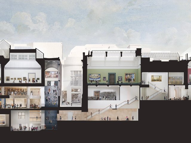
Colour and its effect on museum audiences has always preoccupied museum curators and directors. In her book Spaces of Experience: Art Gallery Interiors from 1800 to 2000 (Yale University Press, 2009), Charlotte Klonk details the scientific underpinnings of the colours of the National Gallery in London, which itself is unveiling a Selldorf-designed project this month. The National Gallery was among the earliest museums to reject stacked “salon hangs” in favour of sparer displays allowing better contemplation of individual paintings. Charles Eastlake, the gallery’s first director, was among the early advocates for this new approach, which meant the colour of the gallery walls would gain a new importance.
Goethe’s colour theory
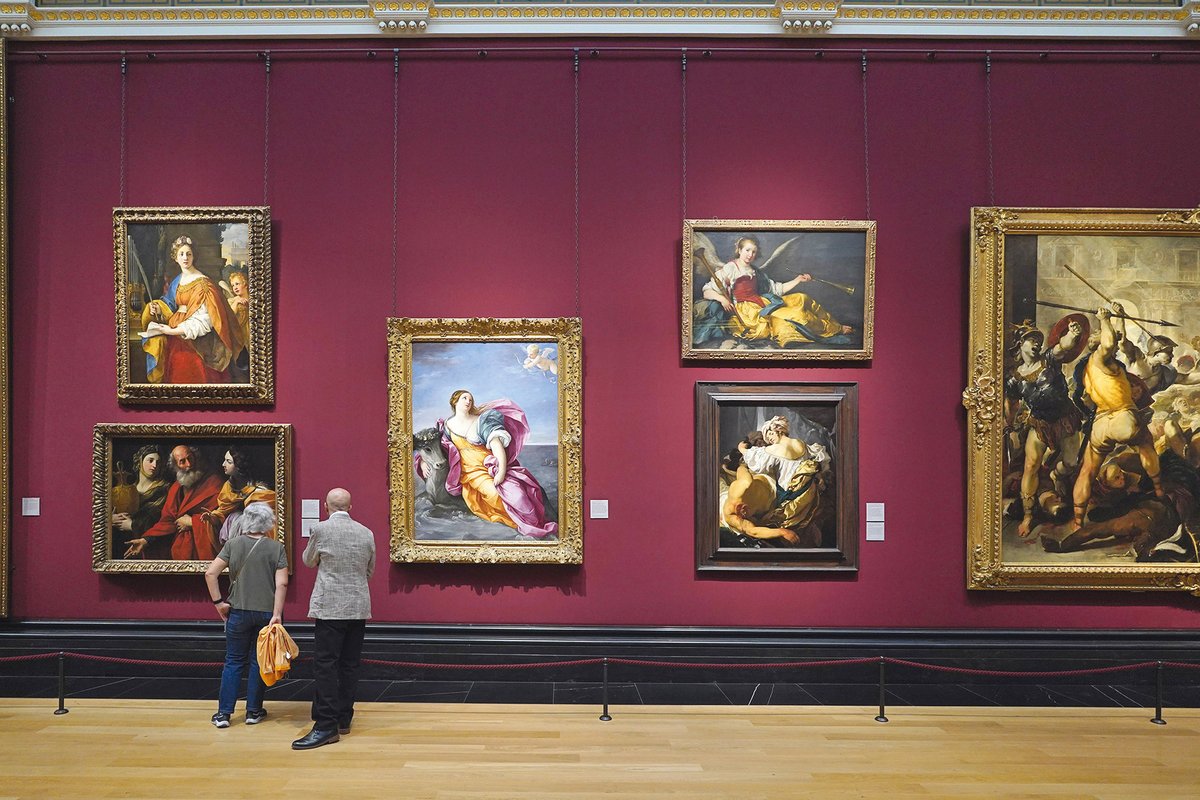
Eastlake’s thoughts on the subjective nature of vision were informed by, among others, Johann Wolfgang von Goethe’s Theory of Colours (1810), which Eastlake translated in 1840. When it came to the walls of the National, Eastlake noted in 1845 that “it may be observed that a picture will be seen to advantage on a ground brighter than its darks and darker than its lights”, that should, among other things, harmonise with the golden frames. Greyish green was the neutral colour of choice before this, but maroon and crimson came to dominate the 19th-century gallery.
Reds and greens have continued to decorate the Trafalgar Square galleries until now. The extent of their enduring orthodoxy more widely was exemplified in a discussion I witnessed about Tate Britain’s 2002 Gainsborough exhibition, whose final room was painted deepest Prussian blue. A senior Tate curator, almost spitting with disgust, opined: “never hang paintings on blue!” And yet, to me, Gainsborough had never looked better. And the rehang at the National Gallery departs from red and green spectacularly in places, and particularly in the Renaissance section, where the paintings are radiant—against walls of dark blue.
But when I think about room colour and art, I often think about an unlikely transcendent project. In Paris in 1946, Henri Matisse, chronically ill and barely able to sleep because of pain and anxiety, began cutting out animal and vegetal forms from white writing paper from his bed. He was in a rather unloved room whose walls had, over decades, turned from cream to sandy beige. His nurses and assistants would stick these birds, fish, foliage and seaweed at his direction over scuffs and grimy patches on the walls. He eventually filled the space, forming two great “reveries”, as he called them, evoking his experiences in Tahiti 15 years before. Océanie, Le Ciel and Océanie, La Mer (1946-48) were immortalised as ineffably beautiful screenprints on linen, Matisse’s first great cut-out decorations. No single colour emblematises thought, of course, but inspiration can be prompted by the most unpromising chromatic environments.